Bar Chart
What is a Bar Chart?
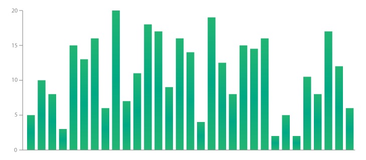
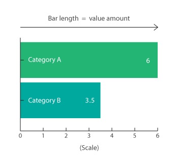
Bar Chart, as known as Bar Graph or Column Graph, is a chart or graph that presents categorical data with rectangular bars with heights or lengths proportional to the values that they represent. The bars can be plotted vertically or horizontally. A vertical bar chart is sometimes called a column chart.
A bar chart shows comparisons among discrete categories. One axis of the chart shows the specific categories being compared, and the other axis represents a measured value. Some bar charts present bars clustered in groups of more than one, showing the values of more than one measured variable.
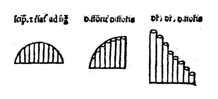
The earliest version of a bar chart was found in a 14th-century book by mathematician Nicole Oresme. Her bar chart plotted the velocity of a constantly accelerating object against time. Each bar was an equal width, while the height of the bar showed the variation in velocity over time.
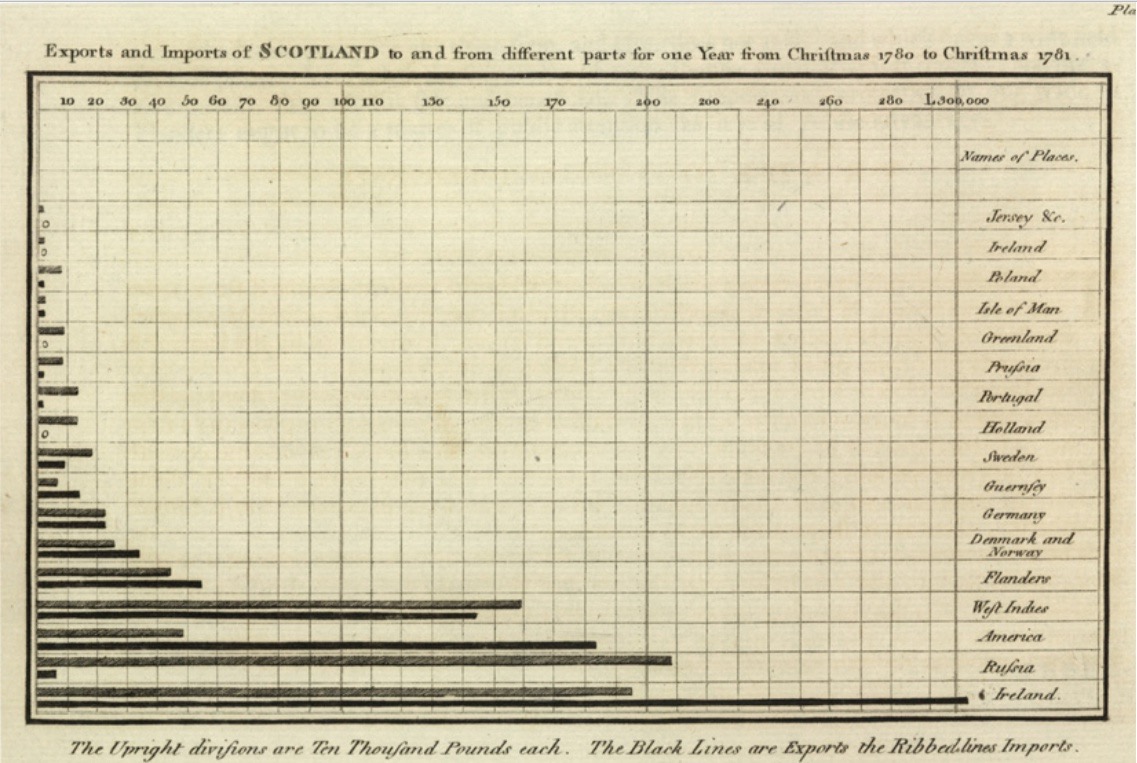
Later, in the 1780s, Scottish engineer William Playfair used bar charts to depict imports and exports in Scotland.
Bar Charts are distinguished from Histograms, as they do not display continuous developments over an interval. Instead, Bar Chart's discrete data is categorical and therefore answers the question of "how many?" in each category.
How to read Bar Charts?
Bar charts can represent quantitative measures vertically, on the y-axis, or horizontally, on the x-axis. The style depends on the data and on the questions the visualization addresses. The qualitative dimension will go along the opposite axis of the quantitative measure. Bar charts typically have a baseline of zero. If another starting point is used, the axis should be clearly labeled to avoid misleading the Viewer.
Many other variations of bar charts exist. Stacked bar charts, side-by-side bar charts, clustered bar charts, and diverging bar charts are representative examples. Labels and legends help the viewer determine the details included in these charts.
What type of analysis do bar charts support?
Bar charts show a comparison of different values in subcategories. For example, bar charts can show how much money a small business spends by expense type. They can also show how many different items each department sold within a store across a consistent interval of time.
Bar charts can also show the effectiveness of different strategies or methods to achieve a goal. If you partition a view to show four or five different strategies or methods applied to the exact same subcategories then you can compare the results for each method. This approach can apply to sales, stock portfolios, budgeting, or medical studies.
A stacked bar chart can show extra detail within the overall measure. Take an office supplies store as an example. Different colored blocks in a bar representing revenue can represent types of sales opportunities. A red block might represent the contribution from office furniture while a yellow block might represent computer supplies.
Bar charts can also show measures over a specific (discrete) length of time, while other chart types can show a continuous amount of time.
When and how to use Bar Charts for Visual Analysis?
Bar charts are versatile and can answer many questions in visual analysis. They can highlight the largest or smallest number in a set of data or to show relationships between values.
| When creating a bar chart, do not: | A good bar chart will follow these rules: |
|---|---|
| Make each bar a different width | The base starts at zero |
| Cram too many bars into subcategories | The axes are labeled clearly |
| Leave the axes unlabeled | Colors are consistent and defined |
| The bar chart does not display too many bars |
Great examples of Bar Charts
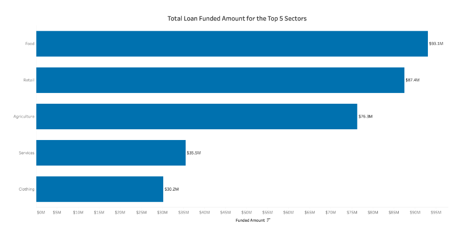
This bar chart measures the number of loans received in each sector of business.
- A single color is used
- Data is sorted from highest to lowest
- Labels are readable
- The axis starts at zero
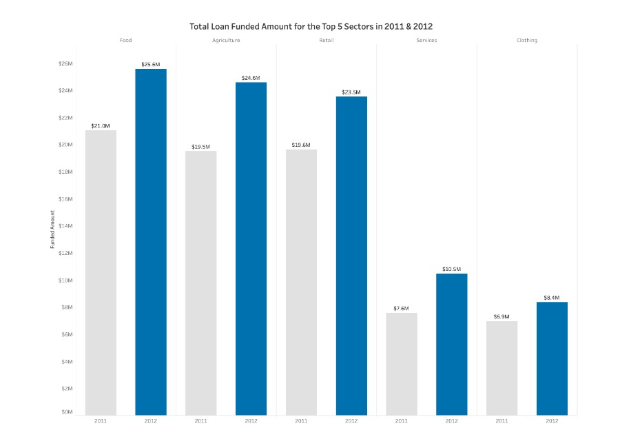
This bar chart is called a side-by-side bar chart.
- It highlights the dominant set of data with a dark color, and the other set with a neutral color
- Sorted from earliest to latest year
- Not too many dimensions compared
Ineffective examples of Bar Charts and Alternatives
| POOR EXAMPLE | BETTER ALTERNATIVE |
|---|---|
This bar chart confuses the reader because its axis doesn’t start at zero and the bars aren’t sorted. Users could be easily misled due to the vertical axis’ starting position.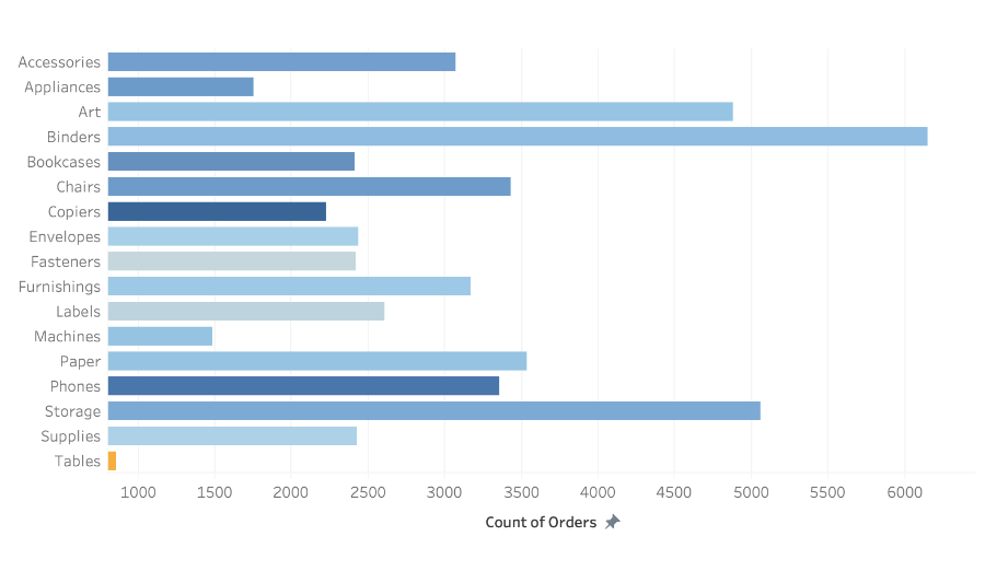 | Making sure the axis starts at zero prevents confusion by starting at a universally understood baseline and sorted bars make it easy to identify rank within Subcategories.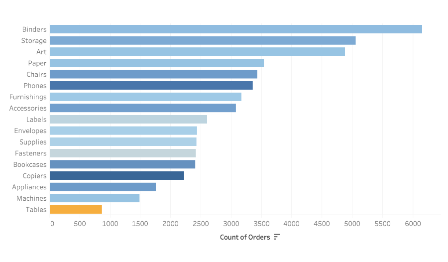 |
This chart is a bad version of a side-by-side bar chart.
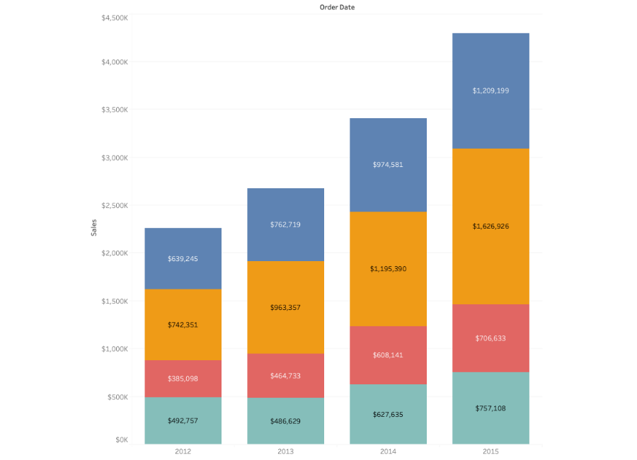
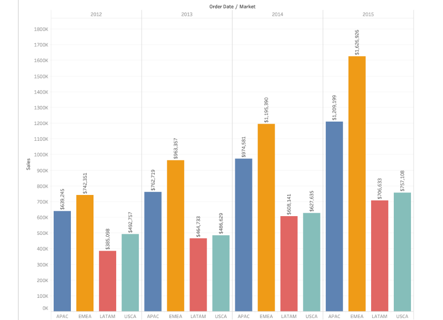 | A better alternative would be the stacked bar chart, a close relative to the side-by-side bar chart.
 |