Overview
People often use "charts" and "graphs" to describe the largest family of visualizations. They may choose the term based on an academic convention. Or because they believe the distinction between them is important. Sometimes the terms complement one another. Sometimes they are synonymous. And sometimes people use them to make minor distinctions between types of visualizations.
Charts display many forms of analysis in a visual format: comparison, relationship, distribution, and composition. No two charts tell the same story. Consider the kind of data you want to present and the implications you want your audience to draw from that data before you decide what to use.
What is a Chart? How do I use it?
What is a Chart? How do I use it? A chart is a representation of data in the form of a graph, diagram, map, or tabular format. This could make the other two families, Geospatial and Tables, subfamilies of it. We distinguish between them to help you identify when one works better for your data. Consider the most common Charts: Scatterplots, Bar Charts, Line Graphs, and Pie Charts. These chart types, or a combination of them, provide answers to most questions with relational data. They are the backbone of performing visual analysis on non-geospatial data.
Visualizing data with Charts relies on drawing points using cartesian coordinates (Ex. X, Y, Z) based on a set of dimensions and measures. Dimensions (Ex. categories, dates, etc.) group the measures (Ex. profit, deaths, temperature, etc.) for analysis. The measures are then rendered on the corresponding coordinates to create a visualization. Some types of visualizations excel at displaying many dimensions (Ex. Ordered Bar Charts), while others can only support a few with clarity (Ex. Pie Charts).
Each Chart type has its own strengths and weaknesses. But if used well people will understand the data better. When you pay attention to aesthetic conventions you can also make your visualization beautiful. You will combine both form and function to affect the viewer’s perception of the data.
How to choose the right chart for your data
Choosing the right chart is a fundamental task in order to guarantee a good communication and visualization of business data that allows us to make a good analysis.
Dr. Andrew Abela’s method

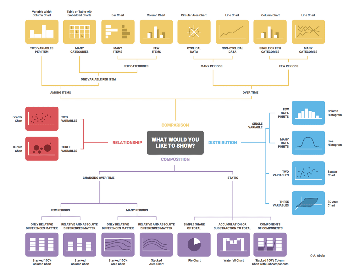
Perhaps the best known, it is based on a chart selection diagram created in 2009 by Dr. Andrew Abela as part of the Extreme Presentation method.
It all starts by asking what you want to represent with the data, and according to the answer the charts can be grouped into four main types:
- Comparison: when we want to compare the different values or attributes within the data with each other. There are some variants, depending on the data. For example: Does the data include the time variable? How many time periods? How many variables and categories do the data present?.
- Composition: when we want to know how the data is composed, that is, what general characteristics are present in the data set. There are some variants, depending on the data. For example: Are there changes over time? With how many time periods? In static data, do you have values that accumulate?.
- Distribution: when we want to understand how the individual data points are distributed within the entire data set. Depending on the number of variables in which we want to analyze the distribution, we can choose bar charts, line charts or scatter charts.
- Relationship: in this case we are interested in knowing how the values and attributes are related to each other. To face the values, scatter charts are usually used when two variables are involved, and bubble charts are used when three variables are involved.
Of these four types, it is most likely that in the majority of cases the first two, Comparison and Composition, will be used, unless you have advanced statistical analysis needs.
As you can see, most cases can be solved with a few types of basic charts, although multiple variants can be applied for each specific case. We can say that the most used charts are those of bars and lines in all their variants (horizontal or vertical, simple or stacked, etc.). When great detail is required, the data table is generally used.