Responsive & Adaptive
Online demo: http://www.liquidapsive.com
Basic Concept
Before introduction on responsive and adaptive design, let's start by Static and Liquid which are basis of responsive and adaptive design.
Static
Static layouts are the traditional web: one design that sits in the center of the page and requires horizontal scrolling if the window is too small for it. M dot sites (m. site is a website that's specifically designed for mobile devices, and exists on a separate subdomain) are the traditional answer to this, providing a wholly separate site for a lower resolution - and all the work of creating a separate site.

Liquid
Liquid (also called "Fluid") is characterized by scaling the width of parts of the design relative to the window. It tends to fail when the window is much smaller or much larger than it was originally designed for.

Adaptive Web Design
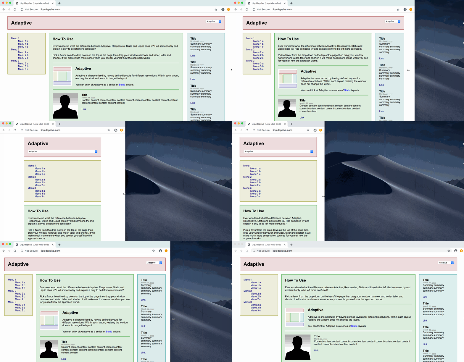
Adaptive is characterized by having defined layouts for different resolutions. Within each layout, resizing the window does not change the layout.
You can think of Adaptive as a series of Static layouts (though, you may inject some liquid elements of course).

Responsive Web Design
Responsive is characterized by having defined layouts for different resolutions. Within each layout, the design is liquid and resizes the width of elements relative to the changing window size.
You can think of Responsive as a series of Liquid layouts.

According to the responsive design, websites must have the following components:
- One flexible layout
- Flexible media
- Media queries
Grid-based (flexible layout) allows you to adjust one layout to different devices and browsers, where the content changes proportionally to the screen size. The trick is that instead of pixels you use percents, vw and rem for size.
Flexible images (media) an image changes proportionally according to the relative blocks but never becomes wider than the block where it is situated (maximum width must be appointed to all pictures, videos, etc). This component is a must for mobile responsive websites.
Media queries are a part of CSS standard. They are used in responsive web development to optimize a picture according to a certain device's screen resolution, where the website might be opened.
Summary
- Responsive Design
- Series of Liquid (use
%,vw,rem,flex,gridas usual) - All devices share same code
- Series of Liquid (use
- Adaptive Design
- Series of Static (use
pxas usual) - Each device has different codes
- Series of Static (use
